Groq
Background
Groq builds ridiculously high-performance, but astonishingly simple chips that are powering the next generation of machine learning. To do this, they’re taking a radical approach to chip architecture — they’re simplifying it, reducing compute to just the most essential elements. They, in essence, grok. Complete comprehension. Groq sought out the Big Monocle team to build their brand from the ground up, starting with a brand sprint with the founders that uncovered the brand ethos the identity hinged upon: “Simplify compute, everywhere.”Solutions
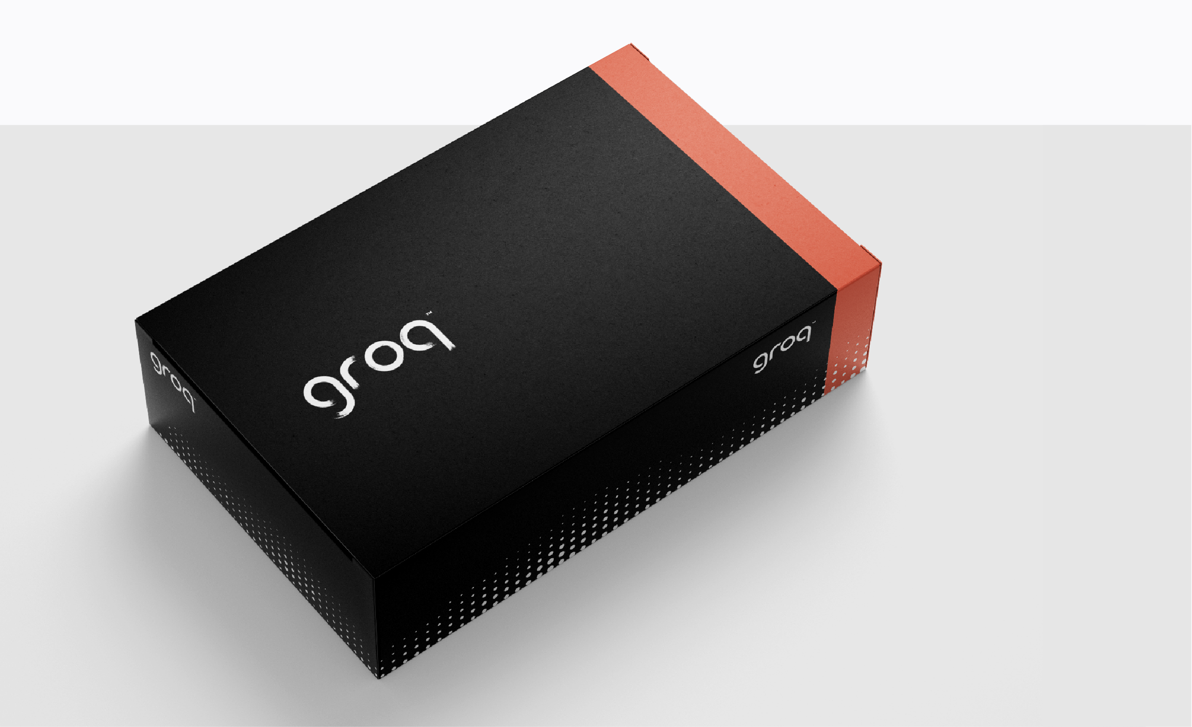
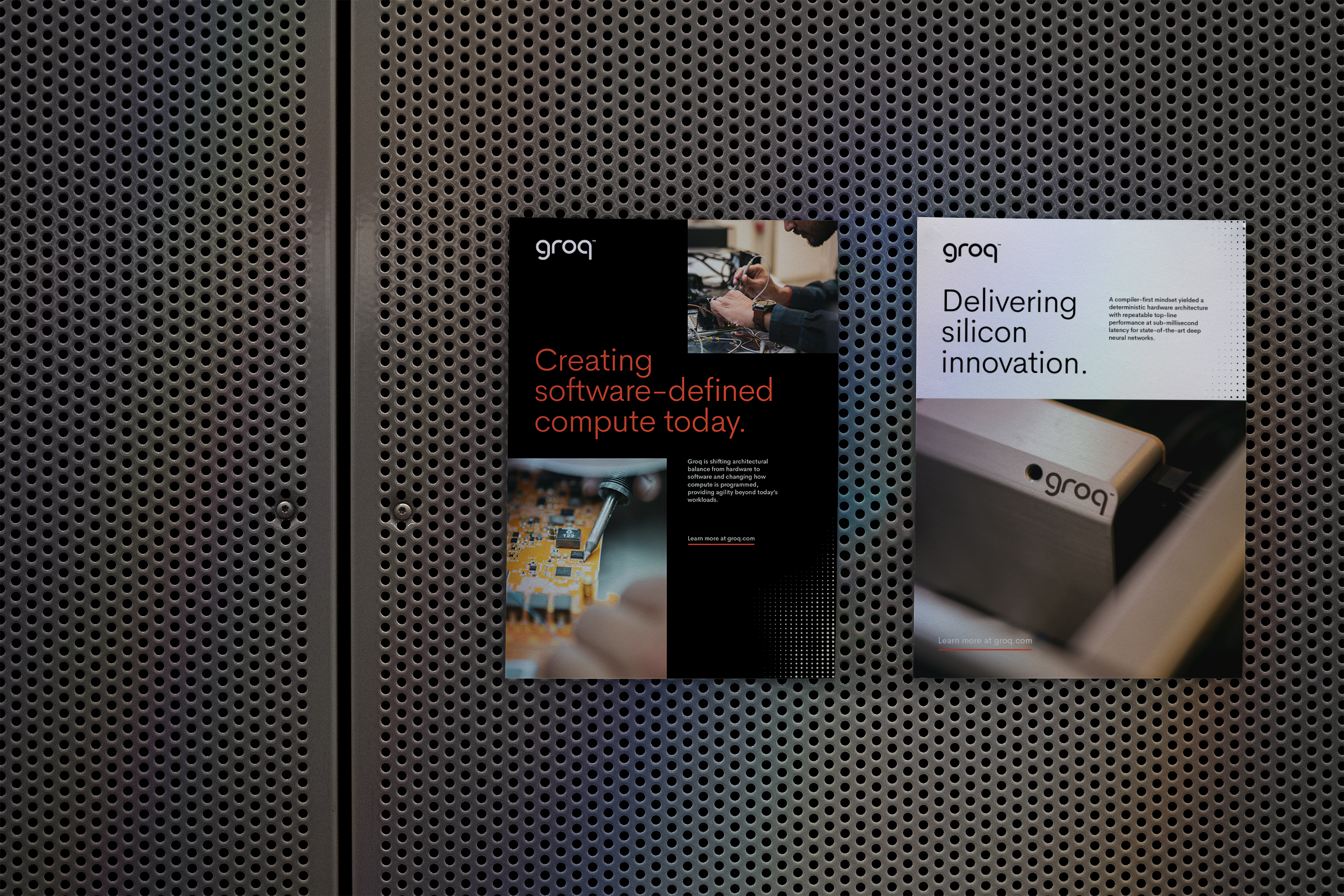
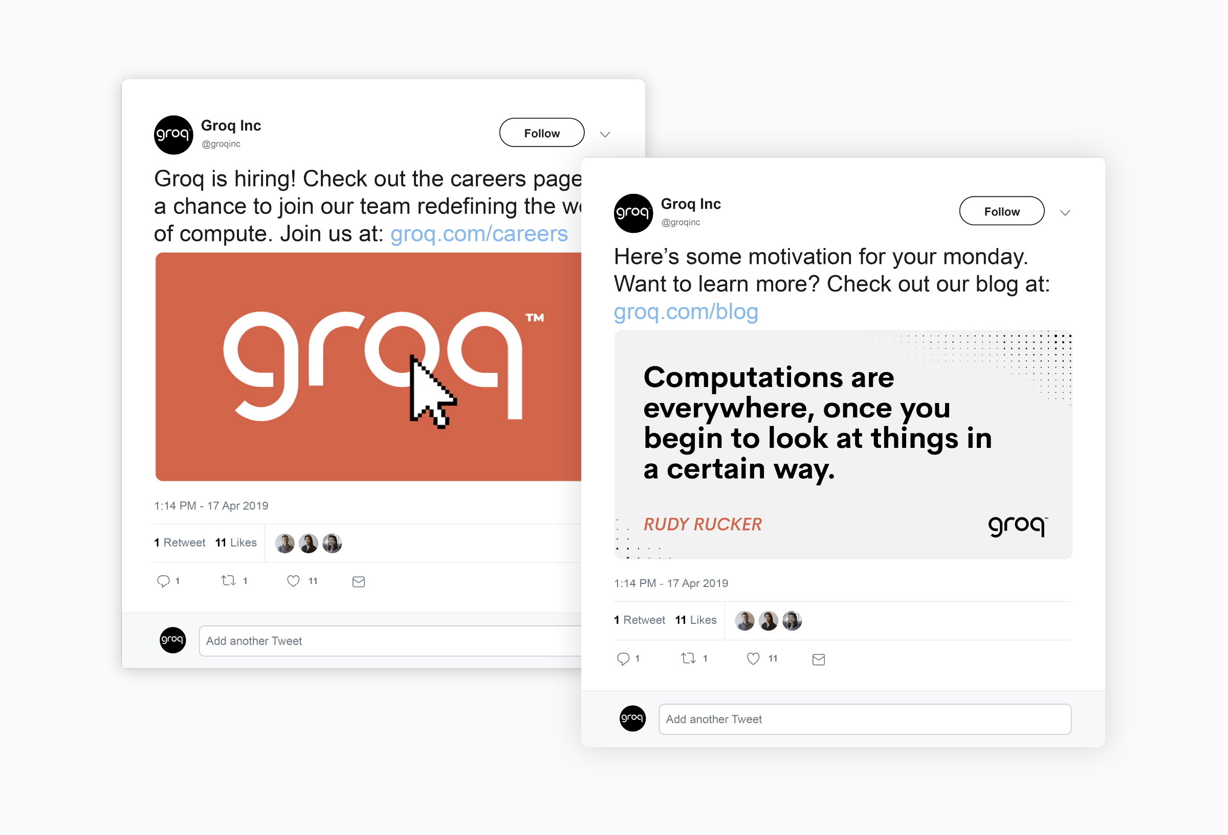
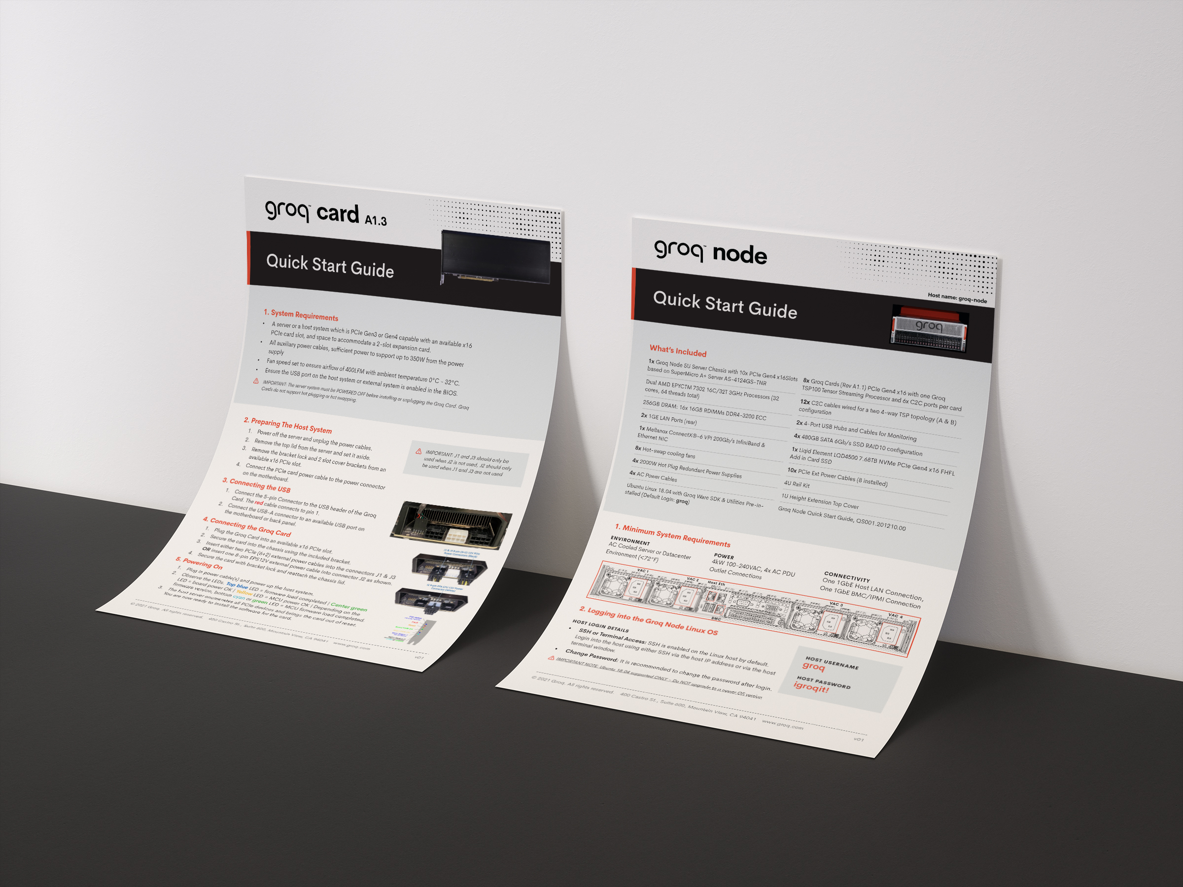
I lead the development and design of Groq’s full brand system from logo through to the first version of their website. In order to communicate the groundbreaking nature of Groq's technological advancement in chip innovation and effectively express their mission to “simplify and reduce compute to its most essential elements, everywhere,” we focused on a custom wordmark (with textural secondary variants that refer to the designers and audience of their products), restrained color palette and a graphic pattern device that speaks to computation and information processing. Not only did we set Groq up for success, we became an extension of their marketing team, applying the brand to everything from presentations and user quick-start guides, to chip board packaging and trade show displays.Since the redesign, Groq has been valued at over $2.8 billion and grown their employee base 300%.
︎︎︎ www.groq.com
PROJECT TYPE
Branding & Identity
Logo Design
Print/Editorial
Web Design
Art Direction
STUDIO
Big Monocle
Branding & Identity
Logo Design
Print/Editorial
Web Design
Art Direction
STUDIO
Big Monocle


DILLON SCOTT BLUE™ → EST.1994 → SEATTLE → AVAILABLE FOR FREELANCE